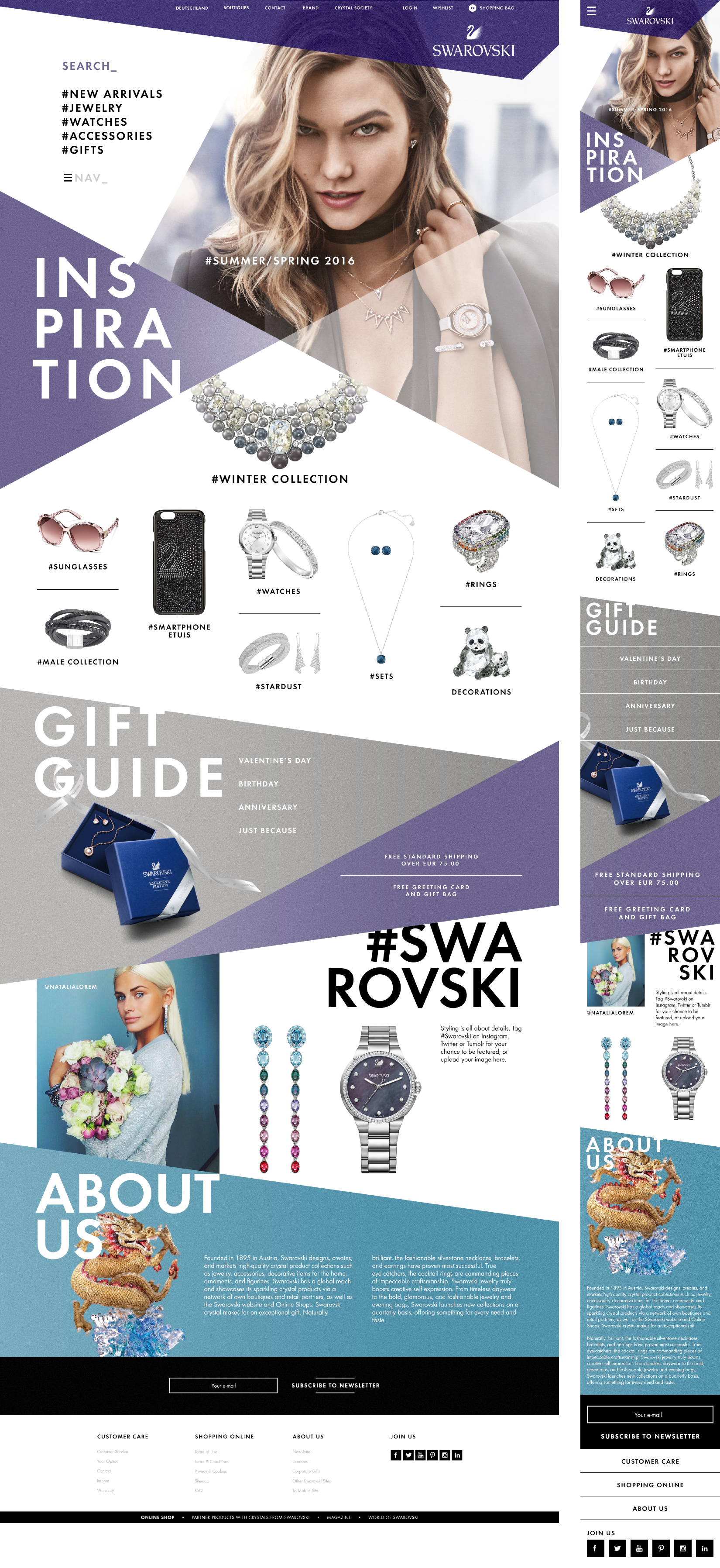
A global responsive website.
My work: art direction (I was hired for finding design directions in the beginning of the project. The final website looks different now)
Homepage
In this design the grid was broken without really breaking it. Lots of white space, large fonts divide the page into areas - an elegant but modern twist.
category page
big header for an easy recognition


