

Vacheron Constantin
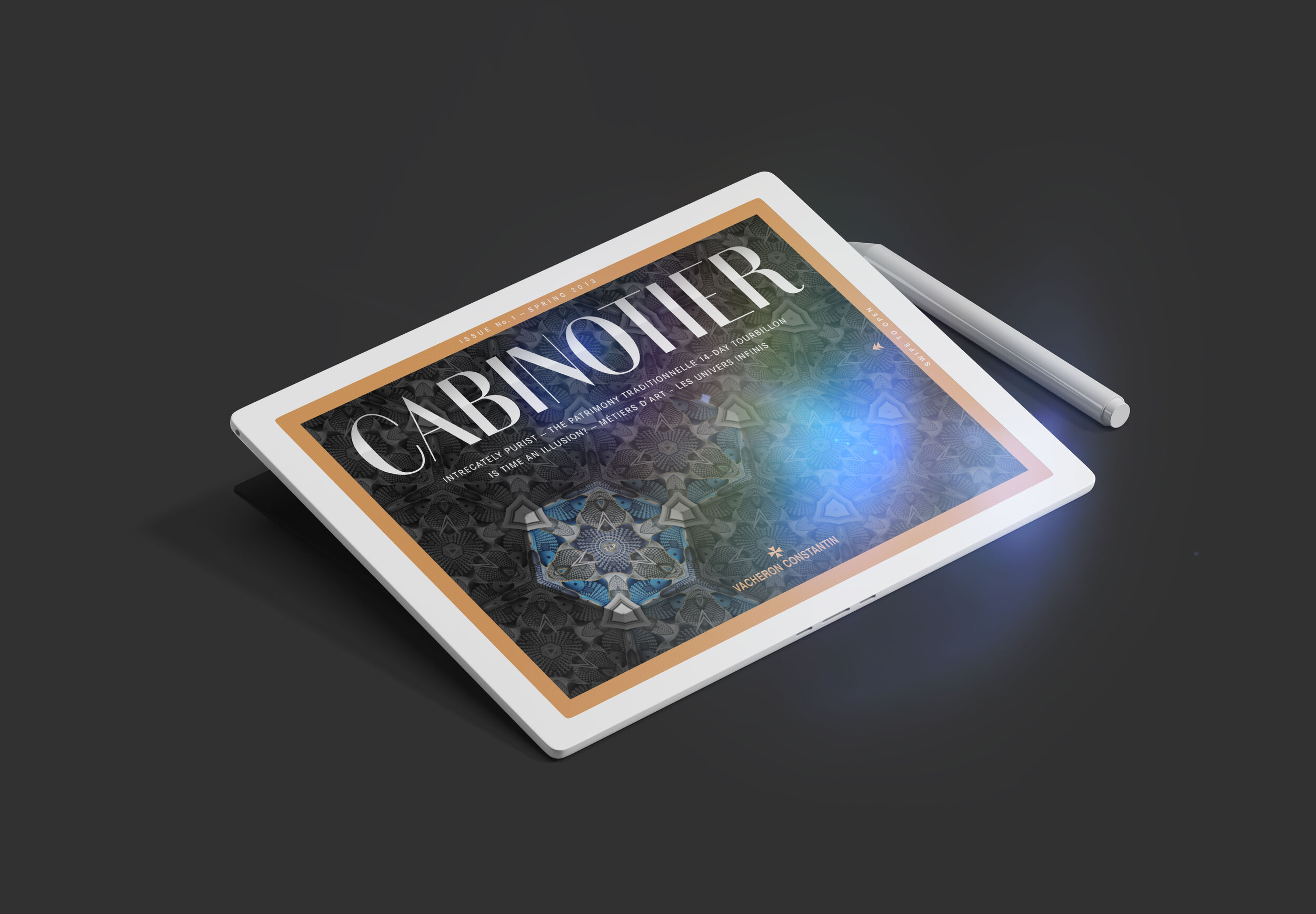
Cabinotier iPad App – Magazine.
My work: art direction, ui, visual concept, icons, production
Freelance job for C3 - the former KircherBurkhardt
Cover — the face of the app
We really wanted to make a cover that the user would interact with. So we programmed a kaleidoscope of what moves with the iPad

This article describes an "Escher limited edition" of a time piece from Vacheron. We interpreted the theme of clocks doves, fish and starfish. When the user moves the iPad, the animals move in the article.
illusion
see the article in motion

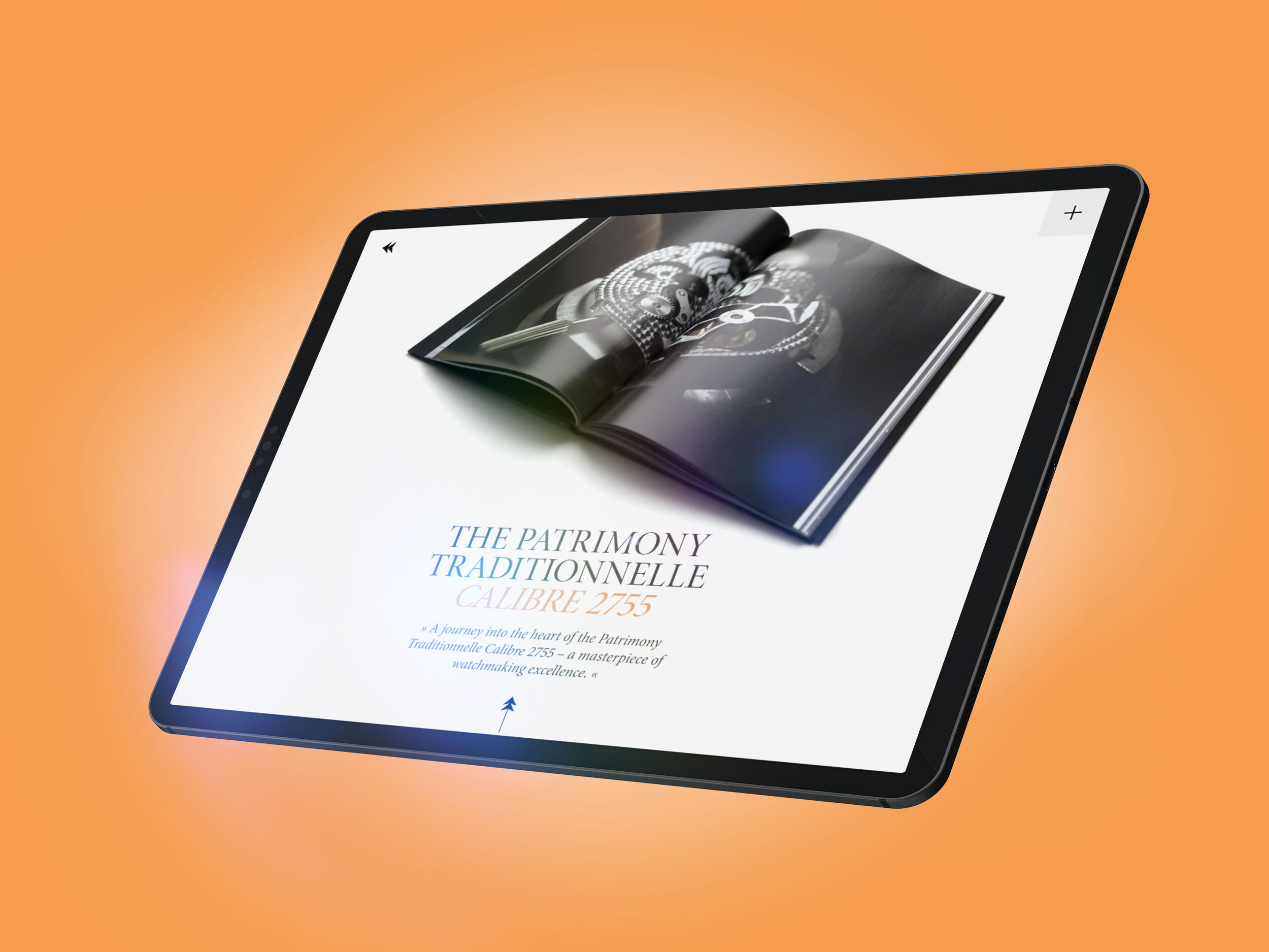
This article is all about the craftsmanship.

Our intention was to use elegant typography. We chose the Minion Pro. The color gold is also an important issue and has become the main color.

this is a collection of news and columns. The right and left sides are separated. When you scroll through one side, the other side moves more slowly

the column article
The history of Vacheron Constantin
This article was a lot of work. We hired an illustrator to develop the look and feel. Then we created different levels of different lengths. As you scroll through the article, all levels move slower and slower from front to back. So you have the illusion of a landscape.